
It's a brand new year, and Windows Central just got a makeover.
The year 2018 was a great one for us, with steady growth across all major performance metrics. We have more people writing more stories than ever before, and the quality of those posts has never been higher. We don't want to brag, but we're pretty darn proud of Windows Central these days.
The next step in our evolution is a major brand redesign. We're rebranding Windows Central, our YouTube channel, and some of our core personalities, with a more modern, more mature look and feel. And we wanted to share some thoughts on our redesign process, as well as some details on the development of our new logo and design elements.
What's new on Windows Central?

So what exactly has changed? Short answer: a lot, at least aesthetically.

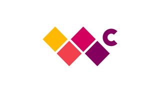
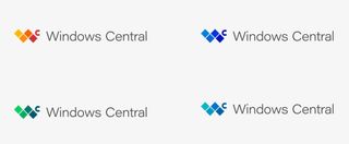
Perhaps most notably, we have a brand new logo. We also have a shiny new set of colors to grace that logo. And instead of just having one main color we use on everything (see ya, Windows Central magenta, we'll miss ya … a little), the new logo is designed to be a bit more flexible — it can be used with a handful of core sets of colors we specifically picked to match the look and feel of our site, as well as plain ol' utilitarian black or white.
Every single post on Windows Central will not only feature our new logo, but some individual posts could eventually be specially branded based on the content type and how we want to promote our strongest stories.
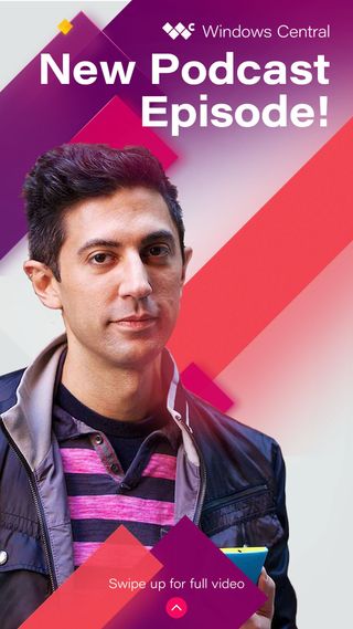
Our YouTube channel and social feeds are also getting some love, and if you're not already following us there, now is a great time to start. Most of the YouTube and Instagram designs will be directly in line with our site elements. But Windows Central personalities (like Executive Editor Daniel Rubino) will also get some people-specific design and branding, though you'll have to wait just a little longer to see those changes.
Get the Windows Central Newsletter
All the latest news, reviews, and guides for Windows and Xbox diehards.
About Windows Central's new logo

The centerpiece of our new site design is, of course, our logo. And though it may seem simple, a whole lot of time, effort and brainpower went into creating it. We wanted our logo to be simple but memorable, beautiful but a little edgy. And we needed it to convey not only where Windows Central is today, but where we, and where Microsoft, are going.
You may have noticed a few similarities between our logo and some common images related to Microsoft and Windows. If so, good. The logo is, of course, an evolution of the Windows "four-square" logo. But we made it our own by using motion to transform what it is a well-known Microsoft image into a graphic that's all our own. And we tapped elements of Microsoft's Fluent Design System in Windows 10 to influence the motion of the transformation, not only in the logo but in many of the other transitional design element.
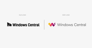
Our previous Windows Central logo was also influenced by Microsoft's Windows logo, too. But as Microsoft evolves, so will we. Our old logo was lovable if a bit one dimensional. Our new logo is anything but. We think it fits our site perfectly.
Ultimately, these new changes are just a glimpse of the good stuff that's to come for Windows Central in 2019. We hope you'll stick around for the rest of the journey.
Al Sacco is content director of Future PLC's Mobile Technology Vertical, which includes AndroidCentral.com, iMore.com and WindowsCentral.com. He is a veteran reporter, writer, reviewer and editor who has professionally covered and evaluated IT and mobile technology, and countless associated gadgets and accessories, for more than a decade. You can keep up with Al on Twitter and Instagram.

