Windows 10 is getting a massive user interface facelift later this year with the release of the Microsoft Fluent Design System, known previously as Project NEON.
Fluent Design is a new system that moves from a traditional boring flat design to a modern design language that delivers more immersive and engaging experiences using new multi-dimensional design techniques. The majority of the changes include subtle additions, such as transparency and blur, three-dimensional perspective and motions, and a system that works across the full range of devices.
Unlike previous design system releases, not everything will be available at once. Instead, Microsoft is planning to push new features of Fluent Design gradually in different waves, with "wave one" arriving with the Windows 10 Fall Creators Update.
In this Windows 10 guide, to make it clear what to expect, we'll highlight the Fluent Design features Microsoft will introduce in the first wave.
Fluent Design principles
The Microsoft Fluent Design System has five primary building blocks, including light, depth, motion, material, and scale that come together in harmony to provide a new set of guidelines to deliver more immersive and engaging experiences for users.
- Light: Incorporates the element of illumination to guide users inside an application. In other words, it's a new intuitive way to draw focus to the right information at the right time on apps. You'll find this element more useful in mixed reality environments where light is used as a visual queue (or pointer) to something you're gazing at.
- Depth: Allows to transform a flat design into a more immersive experience. Adding visual depth using z-axis information makes it possible to break the content apart and reconstruct it using layers that relate to each other adding a sense of three-dimensional perspective and motions.
- Motion: Introduces new animation effects to bring a feel of continuity and establishes context as you navigate the experience.
- Material: Responsible for the physical aspect of elements in the interface. In the real world elements bend, stretch, shatter, bounce, and slide, and Material brings some of that character to Windows 10 and applications.
- Scale: Allows apps to adapt across the full range of devices, including desktop, laptop, tablet, phone, and headsets.
Fluent Design wave one
Based on these five principals, Microsoft will be rolling out Fluent Design in a series of "waves." In the first wave, you can expect at least five features that developers will be incorporating into their apps (and Microsoft into Windows 10), including Reveal Highlight, Acrylic Material, Connected Animations, Conscious Controls, and Perceptive Parallax.
Reveal Highlight
Reveal Highlight is a new kind of interactive visualization that brings illumination to help users to navigate and interact with an app. In essence, Reveal Highlight helps to show hidden borders, interface elements, and to use light as an interaction mechanism to make it easier for users to discover and learn how to use elements.

For example, in the Calculator app, when you move the mouse closer to an element, you'll start to see a glow of light and borders illuminating highlighting exactly what you're about to click. As you move the mouse around the edges of an element, you'll also notice a kind of illumination that emanates around contiguous elements of the interface.
Reveal Highlight is not just about hovering, but when you click an element, you'll see a new pulse of light visualization as well.
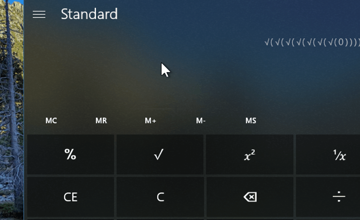
If you're a participant of the Windows Insider Preview program, Reveal Highlight is enabled by default starting with Windows 10 build 16226. You can try out this new feature on ListView and other XAML collection controls, such as on Action Center, Settings app, Microsoft Edge, and across many default apps like Calculator, People, and Maps.
Acrylic Material
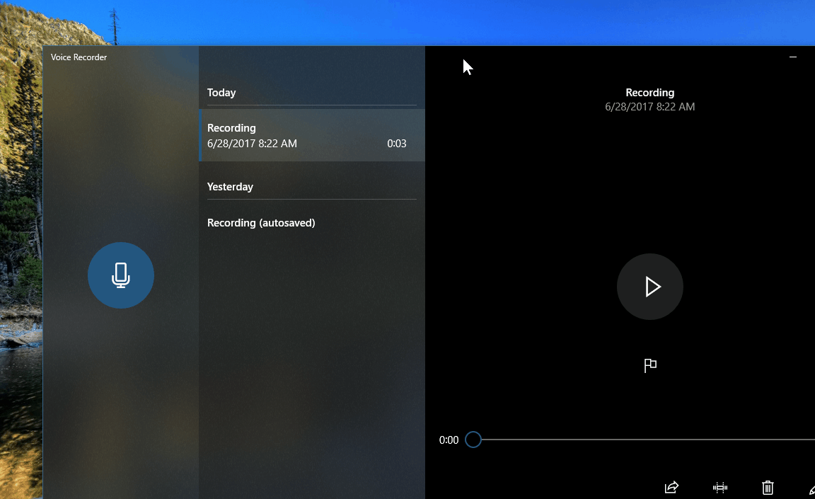
Acrylic Material falls in the "Material" category of the new Fluent Design System. It moves us from a solid color design to a more modern design where the light and colors from the desktop illuminate the surface from behind using a new form of transparency built with graphics techniques typically used in gaming and video production.

The feature has layers of background, Gaussian blur, exclusion blend, color/tint overlay, and tiled noise texture that you'll usually see on navigation pane and specific parts of the user interface. Additionally, Acrylic Material has built-in policies that allow Windows 10 and applications to provide accessibility, user controls, and power management to optimize battery life on devices.

Apps cannot only surface light and colors from the desktop, but they can also show background layers from within the application.
For example, using the Voice Recorder app, you can see how different layers of Acrylic Material had been used to show the desktop background. However, in the Maps app, you can also see this feature, but instead of showing light from the desktop, it uses Acrylic layers to extend the view of the map edge to edge within the application.

In scenarios like when there is nothing to blend with the background, such as when using tablet mode, running low on battery, or using remote desktop, where doesn't make much sense to over utilize system resources, Acrylic Material will adapt to the environment and "solidify." However, you'll still see some elements, such as the noise layer.
Acrylic Material is already available on Windows 10 if you're running the latest test preview. You'll find bits of this new feature in the Start menu, Action Center, Settings app, and in various built-in apps, such as Calculator, Voice Recorder, and others.
If you're running the Windows 10 Creators Update, some apps like Movies & TV and Groove Music already include some Fluent Design elements.

Connected Animations
Connected Animations brings a new form of choreographic animations with motions for interface elements, which adds a fluid transition and context as you navigate within an application.
These animations not only work forward but also backward.
For example, in the Groove Music app, when you click an album the cover there is a subtle choreograph animation to reveal the album's content, instead of hard switching from one page to another.
Conscious Controls
Similar to responsive design you see on the web today, where the user interface adapts to the screen, with Fluent Design, Microsoft is also adding Conscious Controls, which are controls that adapt and respond to the environment and to what you're trying to do.
One example of Conscious Controls is the new scrollbar included on Windows 10, which only appears when required and hides when isn't needed.
Traditionally, as you interact with an application using the mouse or touchpad, the scrollbar will always be visible taking up space. However, with conscious scrollbar, it only shows up when you move the mouse to the edge of the window, which also removes unnecessary distractions from the screen. In addition, when using a precision touchpad or touch-enabled display, the scrollbar won't appear as you use gestures to navigate.
Another example of Conscious Controls includes the idea of text boxes being "conscious" and adaptable to the environment. For example, tapping the address on Microsoft Edge using the pen will bring up the handwriting panel to write with digital ink.

You can try bits of Conscious Controls now on Windows 10 in applications such as the Windows Store, Settings, People, Groove Music, and other apps. If you're an Insider, the new conscious scrollbar is also implemented in the Start menu and Action Center.
Perceptive Parallax
Perceptive Parallax falls into the "Depth" category of Fluent Design, and it helps to move away from the traditional flat design by breaking the content into elements and then layers them together using z-axis adding the feeling of depth, movement, and perspective. In other words, parallax is a visual effect where items in the background move slower than those closer to the user while scrolling or panning.

If you have a computer enrolled in the Fast ring, you can see some pieces of Perceptive Parallax on apps, such as the Windows Store, Groove Music, Photos, and others.
What else is coming in wave two of Fluent Design
While there are several Microsoft Fluent Design System features coming with the Windows 10 Fall Creators Update; that's not all of it. Microsoft will be releasing the new design system in a series of "waves," and there is more to come in wave two. Some other features planned for the next release include 360 Media Playback, Conscious Headers, Speech, Z-Depth Layering, and Spatial Sound.

You can learn more details about the upcoming changes planned for the first release in this Microsoft Build 2017 video session that we're embedding below.
More Windows 10 resources
For more helpful articles, coverage, and answers to common questions about Windows 10, visit the following resources:
- Windows 10 on Windows Central – All you need to know
- Windows 10 help, tips, and tricks
- Windows 10 forums on Windows Central